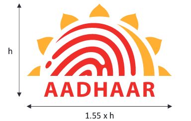
Aadhaar Logo
Concept and the Logo
Aadhaar is the brand name of the erstwhile Unique Identification number (UID). The name and logo for Aadhaar numbers to be issued by the UIDAI have been developed keeping in mind the transformational potential of the program.
Together, the Aadhaar brand (earlier referred to as the 'UID') and logo communicate the essence and spirit of the UIDAI's mandate to people across the country, i.e. - to issue every resident of India, a unique identification number linked to the resident's demographic and biometric information, which they can use to identify themselves anywhere in India, and to access a host of benefits and services.
Aadhaar translates into 'foundation', or 'support'. This word is present across most Indian languages and can therefore be used in branding and communication of the UIDAI program across the country.
Further, Aadhaar's guarantee of unique and centralized, online identity verification that forms the basis for building multiple services and applications, and facilitating greater connectivity to markets.
Aadhaar gives any resident the ability to access these services and resources, anytime, anywhere in the country.
Brand Guideline
AADHAAR logo unit is not a perfect square form. The width of the logo is slightly more than the height and it is important to produce the logo in its exact form, since it is critical to the Brand image. Always verify logo proportions with the measurement given in the diagram below.


